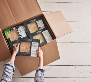
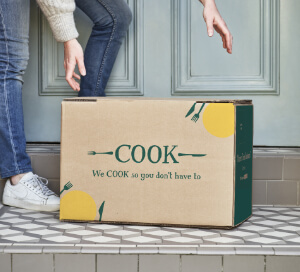
New Core Packaging
Posted on 14 September 2016
Tags: Good Business
Why have we changed our core packaging?
We actually refresh our packaging every couple of years, but this time we’ve made some pretty radical changes, giving our core range a completely new look … but don’t worry, the food inside is just the same.
As well as the new design, we’ve added some new content, too: some fun stuff to read while it’s cooking; simplified information about recycling and our home delivery service; and B Corporation and Living Wage Foundation logos, to show our support and involvement.
The Process:
After some initial research, we pinned down exactly what we wanted our packaging to say on the front.
1. Product Title (obviously!). Each title was individually hand drawn by Katie, one of our brilliant designers. After feedback from customers, we’ve now added the title to the side of the packaging, so you don’t need to pull everything out of the freezer at home to see what you’ve got.
2. Price. We’ve made this a little more obvious, and allowed space around.
3. Portion Size. Pulling this piece of information out, helping it to stand out from the design, again for clarity.
4. ‘Made Like You Would at Home’. This message is at the heart of COOK so we wanted to get this across. So we still have the name of the chef who cooked each meal on the front.
5. Cooking Times. Again, something that’s rather important! The specifics are on the back, as before.
As well as the countless hours Katie spent working on it, people from five different departments worked hard to make it happen. We are incredibly grateful to all of them.
Looks nice, doesn’t it? The new design is already in some shops, and before long it will replace the old style on the core products completely. But, really, it’s what’s on the inside the matters … and the food is the same.


